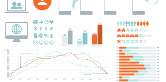
When I think of an infographic I immediately think of this super stunning visual graphic that tells some kind of story. What separates those average infographics from the truly exceptional ones boils down to the narrative. You can have the most visually stunning graphic, but if the data fails to engage the reader all that effort in dressing it up will be in vain. When creating an infographic, the quality of the finished good is always determined by the quality of the content that was used to create it.
Luckily today, finding good quality content has never been easier. Today, governments and trade associations now regularly publish up to date and reliable data that for the most part is free to access. However with this wealth of data at our fingertips, it’s important to ensure that you use the best sources possible for every data-driven infographic that you create. This is why I want to share with you 5 rules that the design agency, Column Five, adheres to when deciding which data they should incorporate into their infographics.
1. Be Sure the Data Tells a Story
According to Column Five’s co-founder, Josh Ritchie, “If you’re not ‘telling a story’ with your infographic, then you’re doing it wrong.” The goal of an infographic is to use the visual nature to assist the reader in understanding a narrative. People are only going to want to engage with an infographic if it tells a story that they care to know. Fortunately for us, there is no shortage of data that’s available today for us to use, but not all data is created equal. It’s important to keep an eye out as not all data is interesting, even if you try to visualize it in an interesting way.
2. Only Use Reliable Sources
Just as not all data is interesting data, not all data is reliable data. When sifting through data to use for an infographic it’s important to try and find as unbiased source as possible. Ritchie points out that most governmental agencies – such as the statistics compiled by the US Census Bureau or the Department of Labor – or industry white papers are good places to look for reliable data. I realize that most of discerning what constitutes as reliable data comes as common sense, however as Ritchie points out “it’s important to note that surveys conducted by polling agencies or think tanks, while useable, often have a political agenda” so it’s always good to exercise discretion when using them. If you’re unsure whether a certain source is worth using, Ritchie offers up several questions you can ask yourself to help you decide:
– Who wrote this webpage? Does the author have credentials?
– Is this webpage affiliated with a credible organization?
– When was the website last updated?
– What is the purpose of the organization that is hosting the website?
– Does the author provide a bibliography?
3. Use Current Data
“The world changes quickly, and the pace of change is accelerating,” says Ritchie. Yes, I know we’ve all had this message drilled into our heads, but when it comes to designing an infographic, it’s important to try and use the most up to date data available. A good rule of thumb is to try and not use any data that’s more than one year old. Ritchie points out that it’s always good to list the age of the data within the sources or in the graphic’s copy, as this will provide context and clarity to the graphic. Should you use multiple sources, make sure they are complimentary. What do I mean? Complimentary sources cover the same types of data, are collected in the same time frame and use similar questionnaire designs. Try to avoid using two data sets that clash, such as data collected by think tanks on opposite sides of the political spectrum, as it makes crafting a narrative difficult.
4. Limit the Number of Sources
It’s nearly impossible to create a consistent narrative if you use fifteen different sources. Each time you add an additional source, think of it as introducing another possibility of a mistake or bias to be entered into your graphic. According to Ritchie, “A good rule of thumb is to use only one data set, if this is an option. Two or three are acceptable, but the more you add, the more variance you get from different methods, different contexts, and different priorities of the data producers.”
5. Cite Sources Appropriately
Just like any paper, it’s extremely important to cite your sources. When you’re creating an infographic from multiple sources it’s critical to provide as much context to the reader as possible about what information came from what source. Remember to always cite the primary source (not the Wikipedia article) in your graphic.
When it comes to creating infographics, remember that they are only as good as the content they convey. Ritchie puts it best by saying, “To produce consistent, high-quality work, ensure that you are always using strong data that are timely, work well with each other, and are provided by reputable organizations.” Do that and I promise you, that your next infographic will be a winner.